

Prototyping and design · 04
Design system
Colours, type and components with rules, so the next screen is assembled rather than drawn. The brand colour changes in one place, and a button looks the same on every screen, whoever draws it.
- 01You tell us about the product and show what's already drawn
- 02We clarify the details by message or a call
- 03We give you the price and timeline of the system
Not sure a design system is what you need? Compare it with the other design services
What the system includes, and where it ends
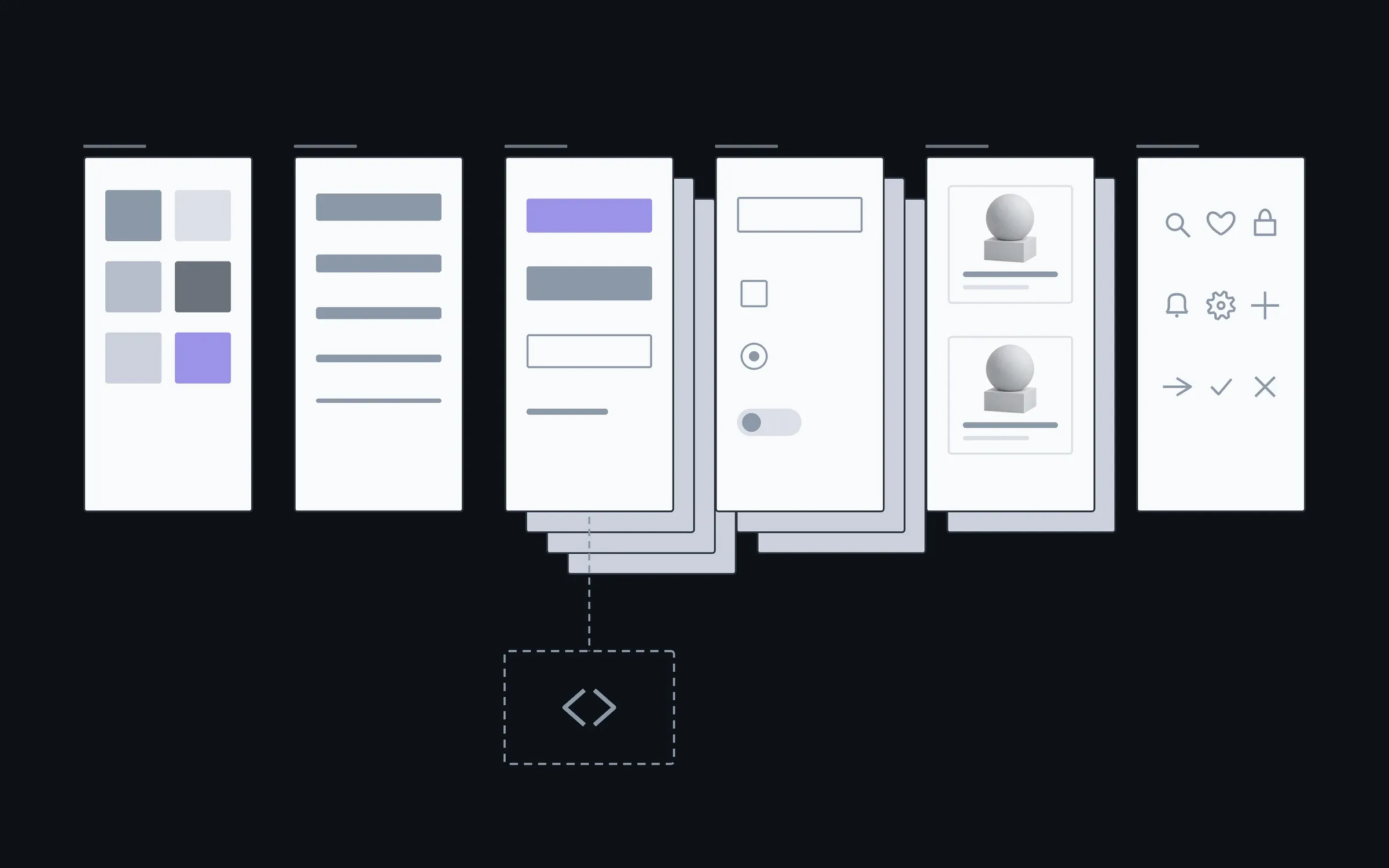
The first list goes into every system; the second we add separately. The system lives in Figma; a library in code is separate work for your stack.
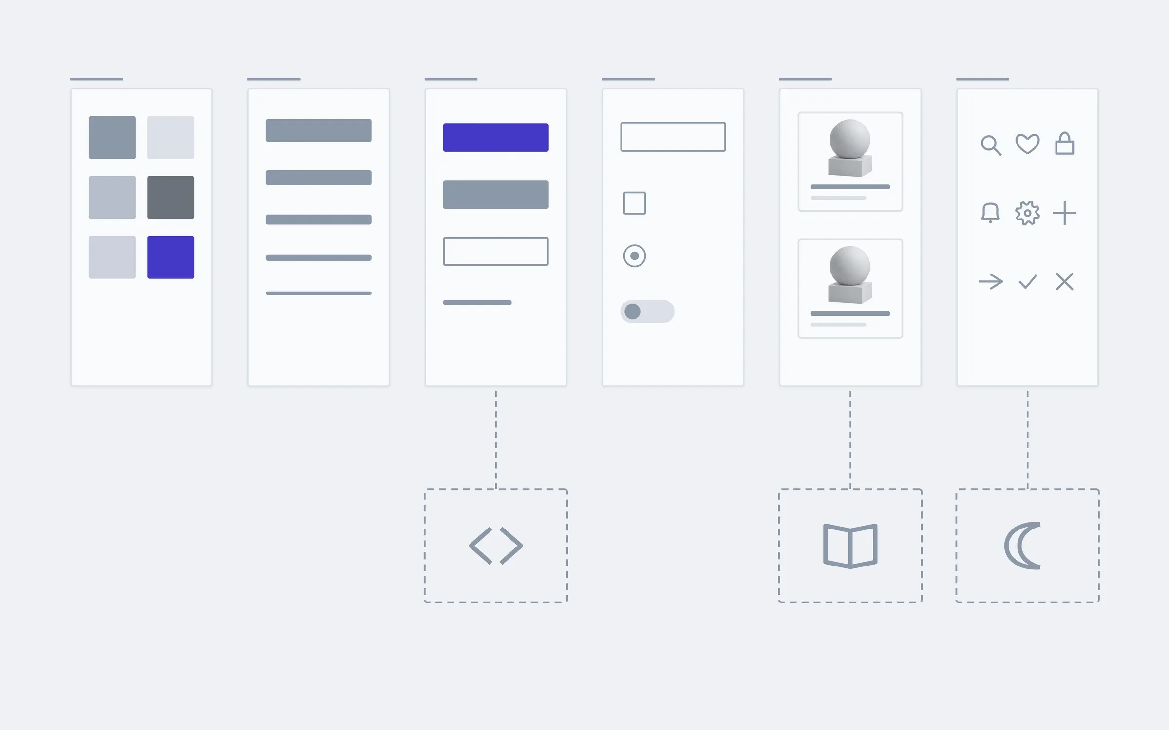
includedseparately, if needed
An audit of what exists
We count how many different buttons, shades and spacings already exist and decide what stays.
Colours and type as variables
Colour and text size are set in one place: change them there and they change everywhere.
Components with states
Buttons, fields, cards and toggles with hover, press, focus, error and disabled states.
Grid and spacing
A few spacing steps instead of dozens of random numbers.
Icons as one set
The same weight and size, so icons from different sources don't clash.
Accessibility in every component
Contrast, visible focus, finger-sized targets, checked against WCAG.
Rules beside each component
A short note on when to use the primary button and when the secondary, so the team doesn't have to ask.
A file for your team
A Figma library in your account that any new mockup can connect to.
Separately
A library in code
The same components ready for developers, so a button isn't rebuilt every time.
A documentation site
A separate page with every component and rule, for a large team or several contractors.
Dark theme
A second set of colour variables, checked for contrast on every component.
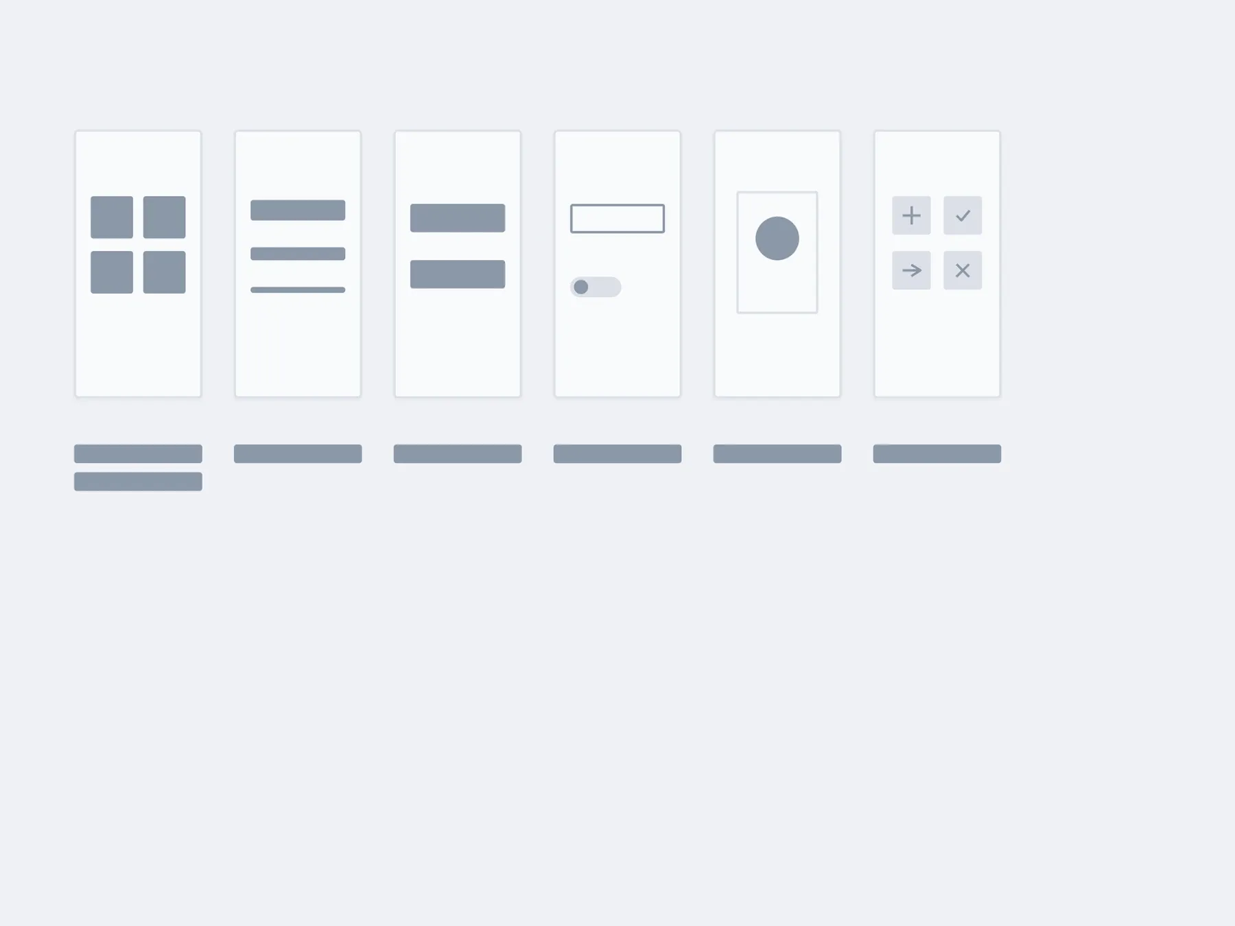
What a shop's design system is made of
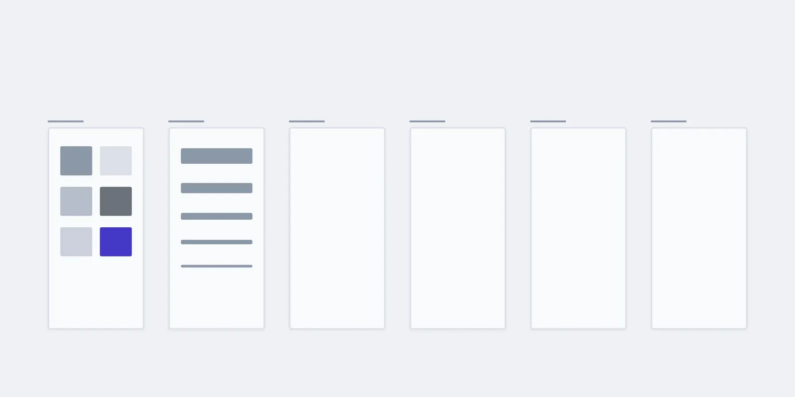
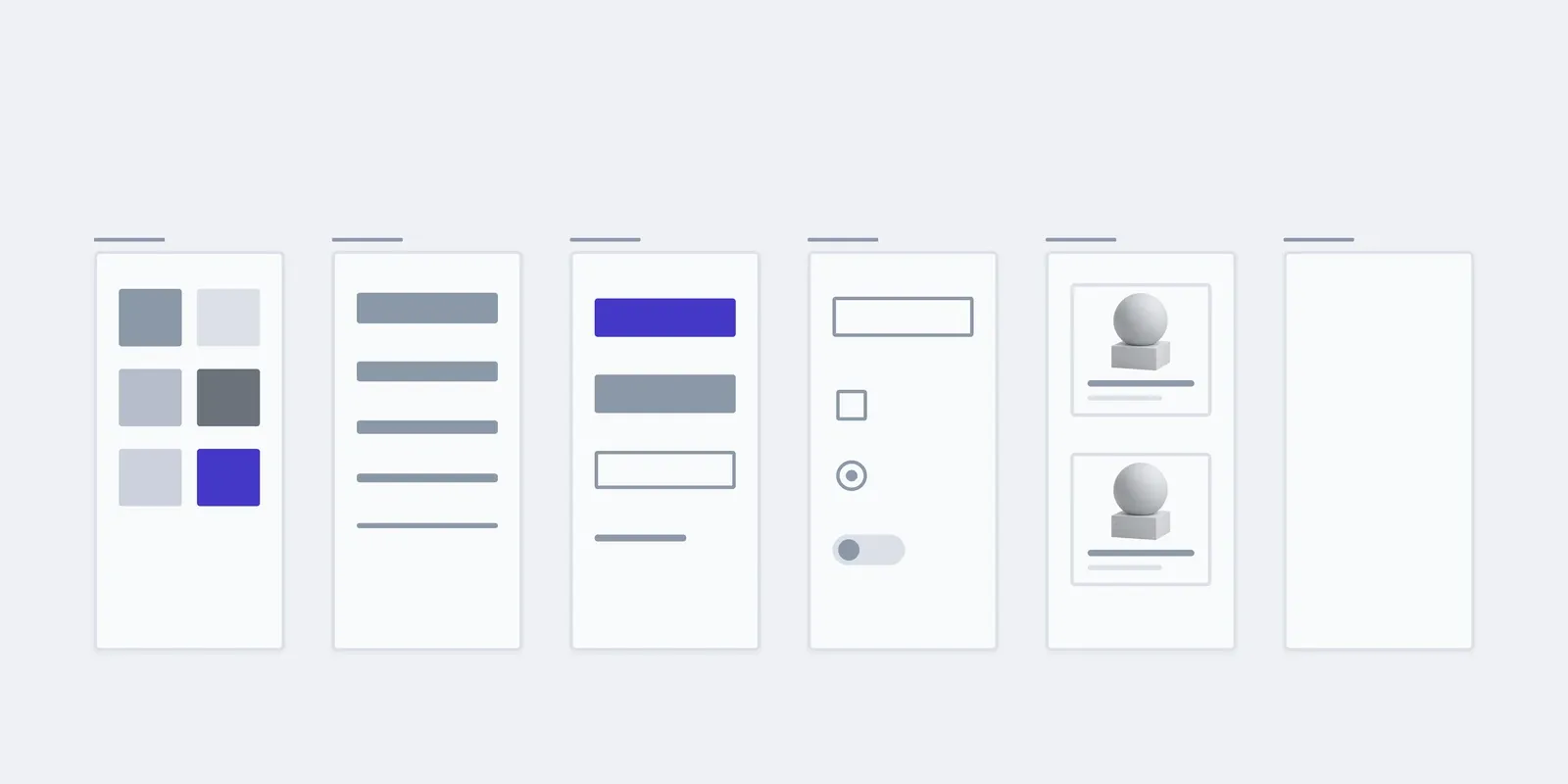
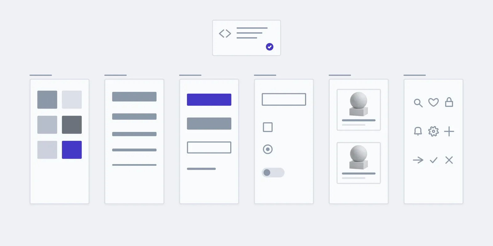
Six groups that any shop screen is built from. A team app has job cards instead of product cards, but the groups stay the same.
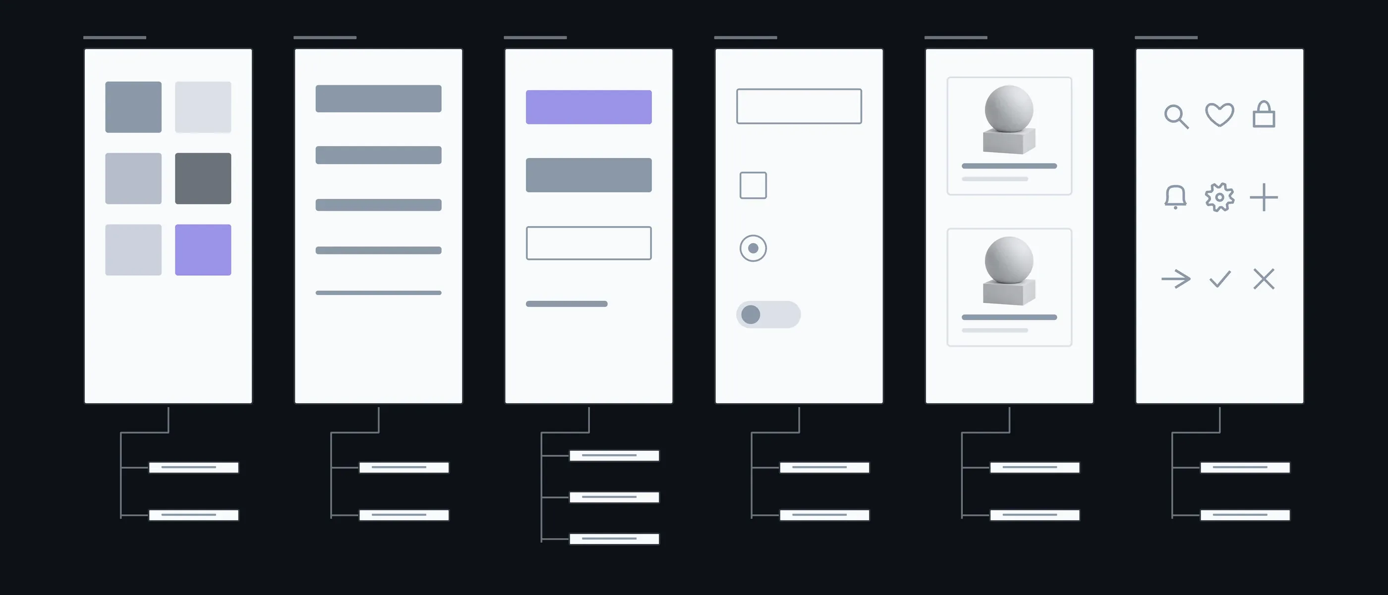
Colours
Core · States
The brand and the colours of error, success and warning
Type
Headings · Body
A few sizes instead of a dozen random ones
Buttons
Primary · Secondary · Link
These are what drift apart most often
Fields
Text · Choice
With a hint, an error and a disabled state
Cards
Product · List
What catalogues and accounts are made of
Icons
Interface · Status
One set instead of three libraries
What you have in hand after each step
First we count what exists, then lay the base of colours and type, and only then draw components on it. That way the system doesn't become one more version of the same mess.
01Conversation
We look at the product, who draws new screens and who builds them.
In hand
A list of platforms, the team and what already exists
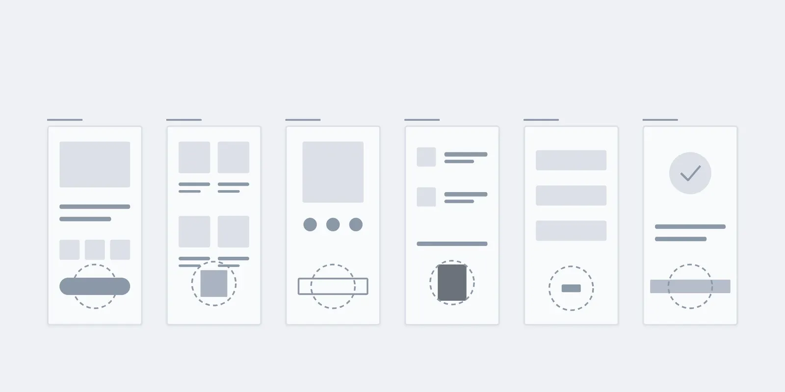
02Audit
We gather every button, colour and spacing from the existing screens in one place.
In hand
A report: what repeats, what differs, what stays
03Foundations
Colours and type as variables, the grid and spacing steps.
In hand
The variables everything else rests on
04Components
Buttons, fields, cards and icons with all their states and rules.
In hand
A component library in Figma
05Handover
We walk your designers and developers through the system and show how to build a new screen from it.
In hand
The library in your account, with its rules
What the price and timeline depend on
A system for one product on one platform takes weeks; for several products or platforms, longer. After the conversation and the audit we give a fixed price for the whole system.
- 01Components and variants
- How many groups, and how many variants in each: one button with three states, or five kinds of button.
- 02Platforms
- A site only, or a site and an app. A second platform adds variants, not a second system.
- 03What already exists
- The more differences the audit finds, the more decisions there are to make.
- 04Code
- The system in Figma only, or a library in code as well. Code is estimated separately, for your stack.
New screens are assembled from components
Your team assembles new screens from what's already in the library, and faster each time. A new component, a booking calendar for example, we draw with you and add to the system under the same rules.
01Handover
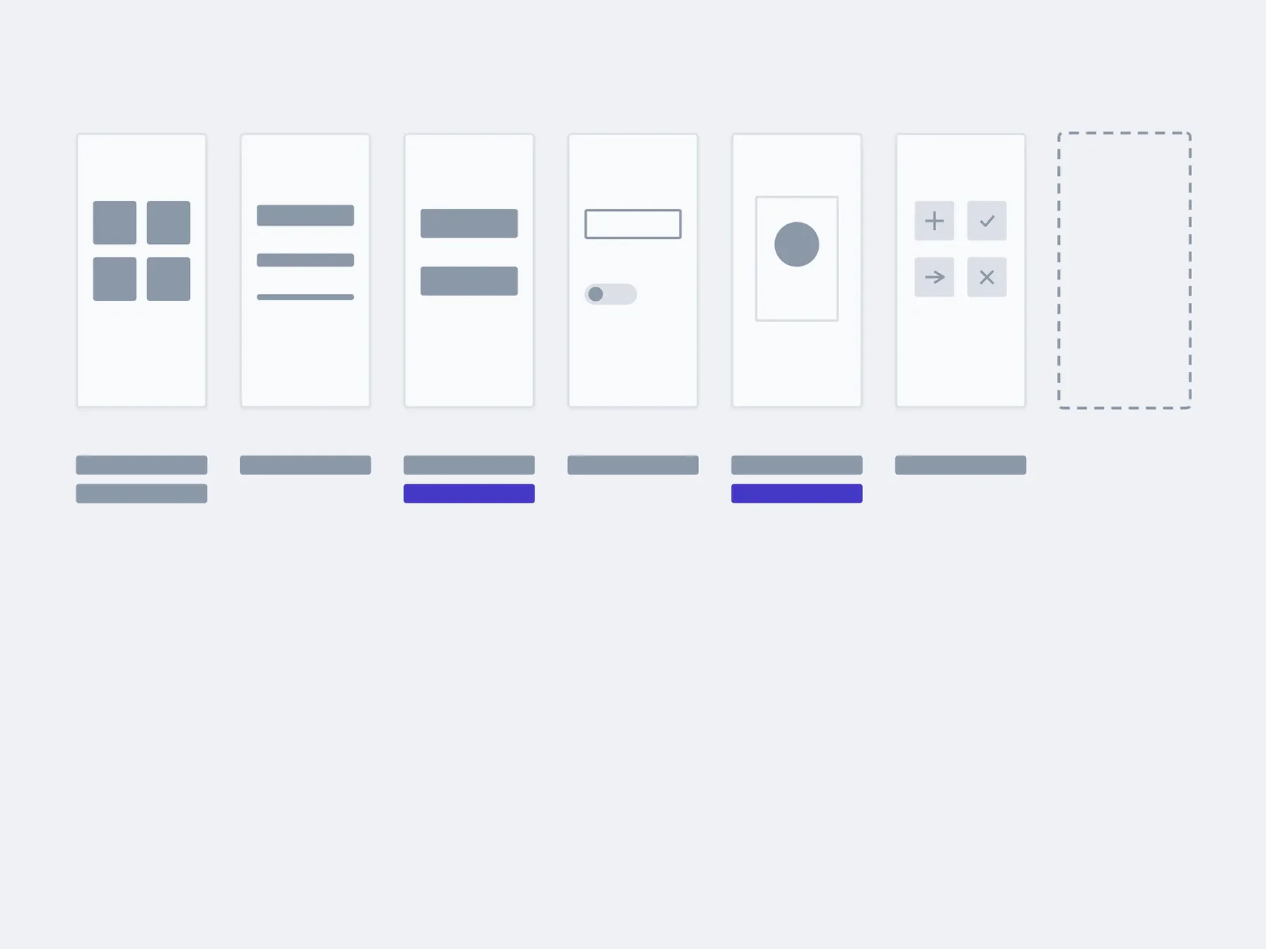
02In 3 months
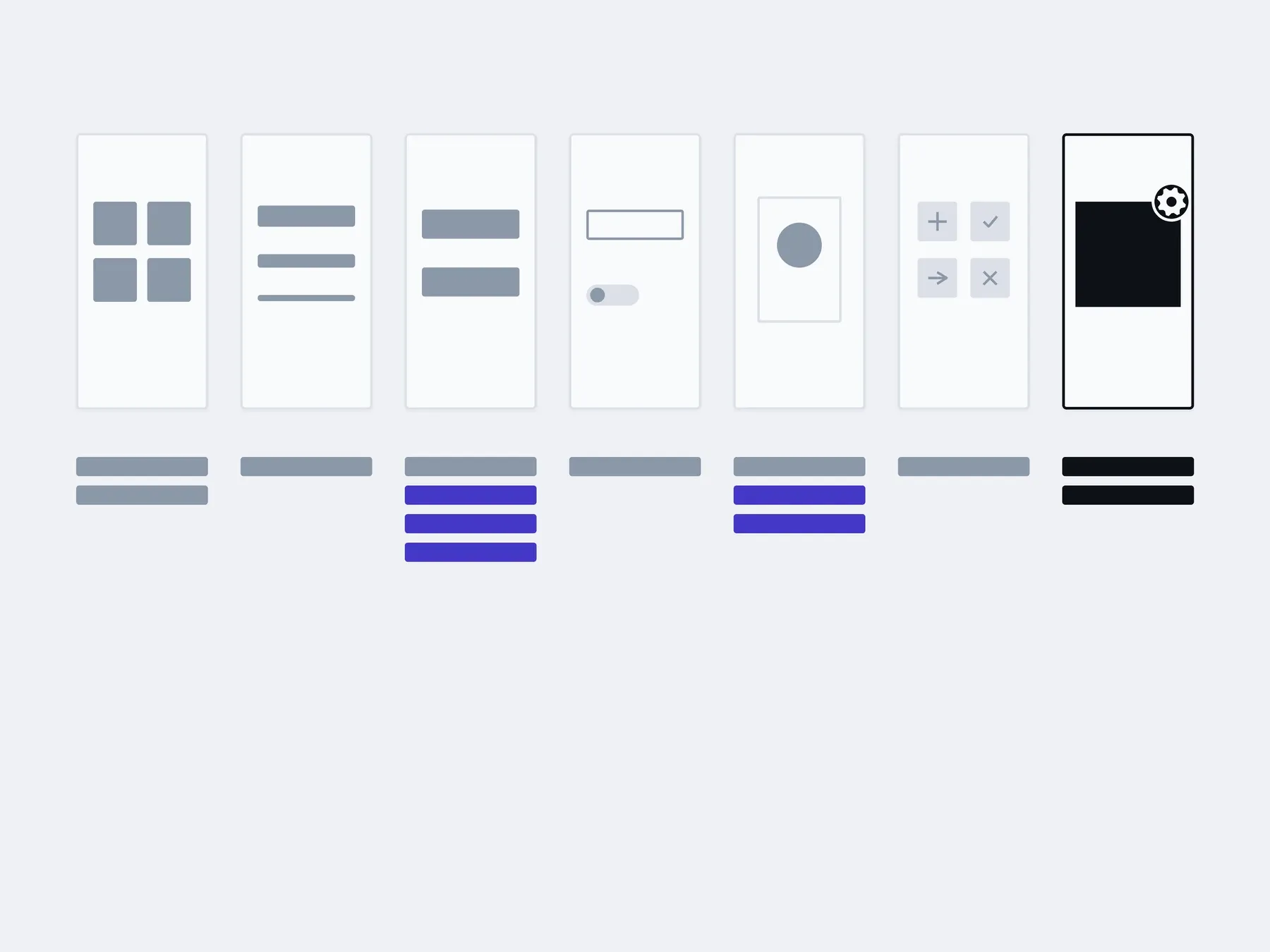
03In six months
assembled by your team from components: new screensadded with us: a new component
The timings are illustrative: an example, not a plan.
You, in the admin
- New screens from existing components
- New site pages
- The brand colour in one place
- New icons from the same set
About design systems
Can I order design only, without development?
A design system pays off when there are many screens drawn by different people. A five-page site needs only a set of components in the mockup; a system earns its keep when a product grows for years.
Design only. You hand the system in Figma to your own team. When you have designers and developers, but no shared rules.
Design and build. We draw the system and carry it into code. When the product is new and it's easier to have the system and the code from one studio.
Tidying up what exists. The product runs, but it has more buttons, shades and spacings than it needs. When every new screen is drawn from scratch and still doesn't match the others.
How much does a design system cost?
After the conversation and the audit we give a fixed price for the whole system. It depends on the number of components and variants, the platforms, how much the existing screens differ, and whether you need code.
Does a small site need a design system?
Usually not. A site of a few pages needs only a set of components in the mockup. A system pays off when there are many screens, different people draw them, and the product grows for years.
How is a system different from a UI kit?
A UI kit is a set of components. A system adds variables, states and rules, so new screens come out the same without a designer standing by.
We already have a design, but everything differs. Where do we start?
With an audit. We gather every button, colour and spacing in one place so you can see how many there really are. The system is built from what we keep.
Do you carry the system into code?
Yes, as separate work. First we look at what your product is built with, then estimate a library for that stack.
Who maintains the system after handover?
Your team, by the rules that sit beside the components. A new component, a new platform or a repeat audit we do with you as a separate stage.
Who owns the file?
You do. The Figma library sits in your account and can be connected to any mockup without us.
What sits alongside a design system
A system holds together the screens that are drawn from a map and checked with a prototype.
- Structure and journeysWhat sits where, and the path a person takes to the thing they came for.
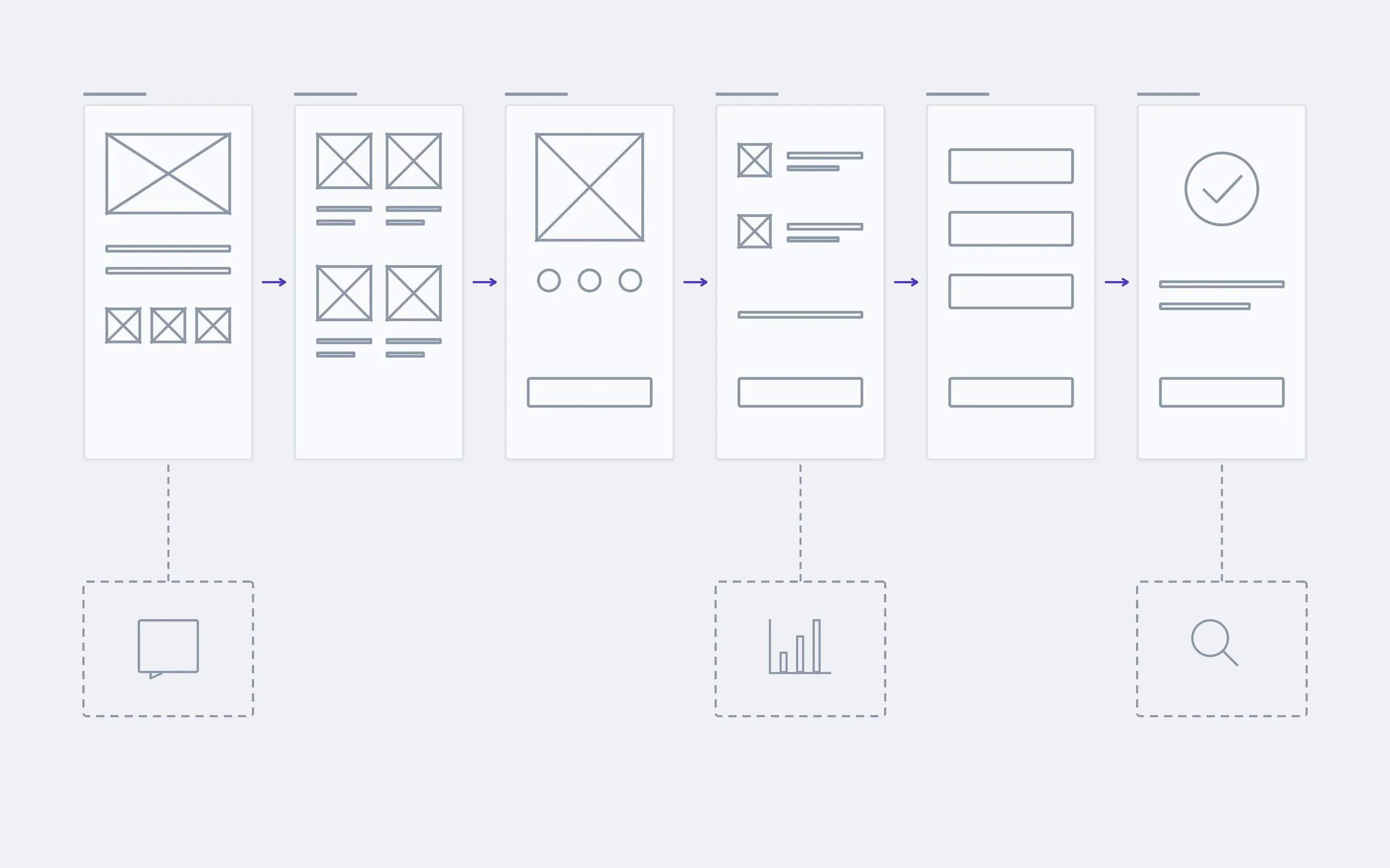
- Screen designType, colour, states. Including the empty screen and the one with the error.
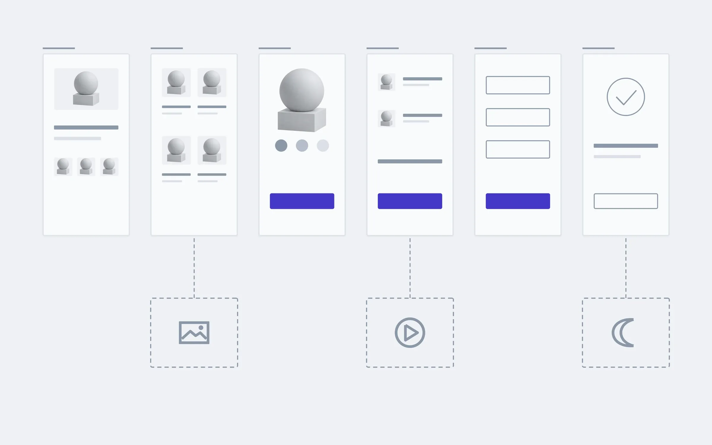
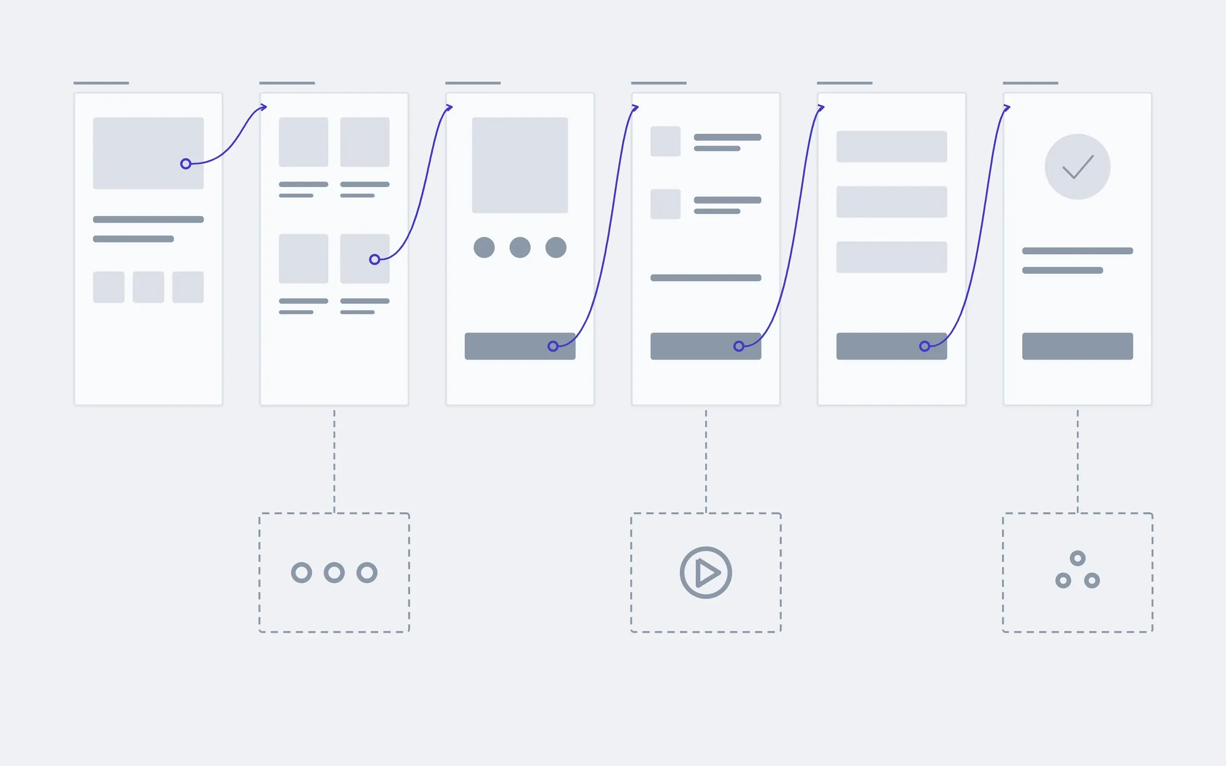
- A clickable prototypeWalk the path with a finger before any code exists.
- This pageA design systemComponents and rules, so the next screen is drawn faster than the last one.
Show us a few screens of your product, and we'll tell you how many different buttons they already have and whether you need a system.
- 01A link
to the site, the mock-up or the repository, whatever exists
- 02What to change
one sentence on what should become different
- 03Who it's for
who will use it: your customers, your team, and how many