

Prototyping and design · 02
Screen design
Finished screens in your style, each with its states: what people see when an item is out of stock, the cart is empty or a payment fails. A developer builds the product from them instead of inventing what the mockup leaves out.
- 01You tell us about the product and show what already exists: a structure, a logo, colours
- 02We clarify the details by message or a call
- 03We give you the price and timeline of the design
Not sure screen design is what you need? Compare it with the other design services
What the design includes, and where it ends
The first list goes into every project; the second we add separately, when it's actually needed. The file always has a set of components; a full design system with rules for your team is a separate service.
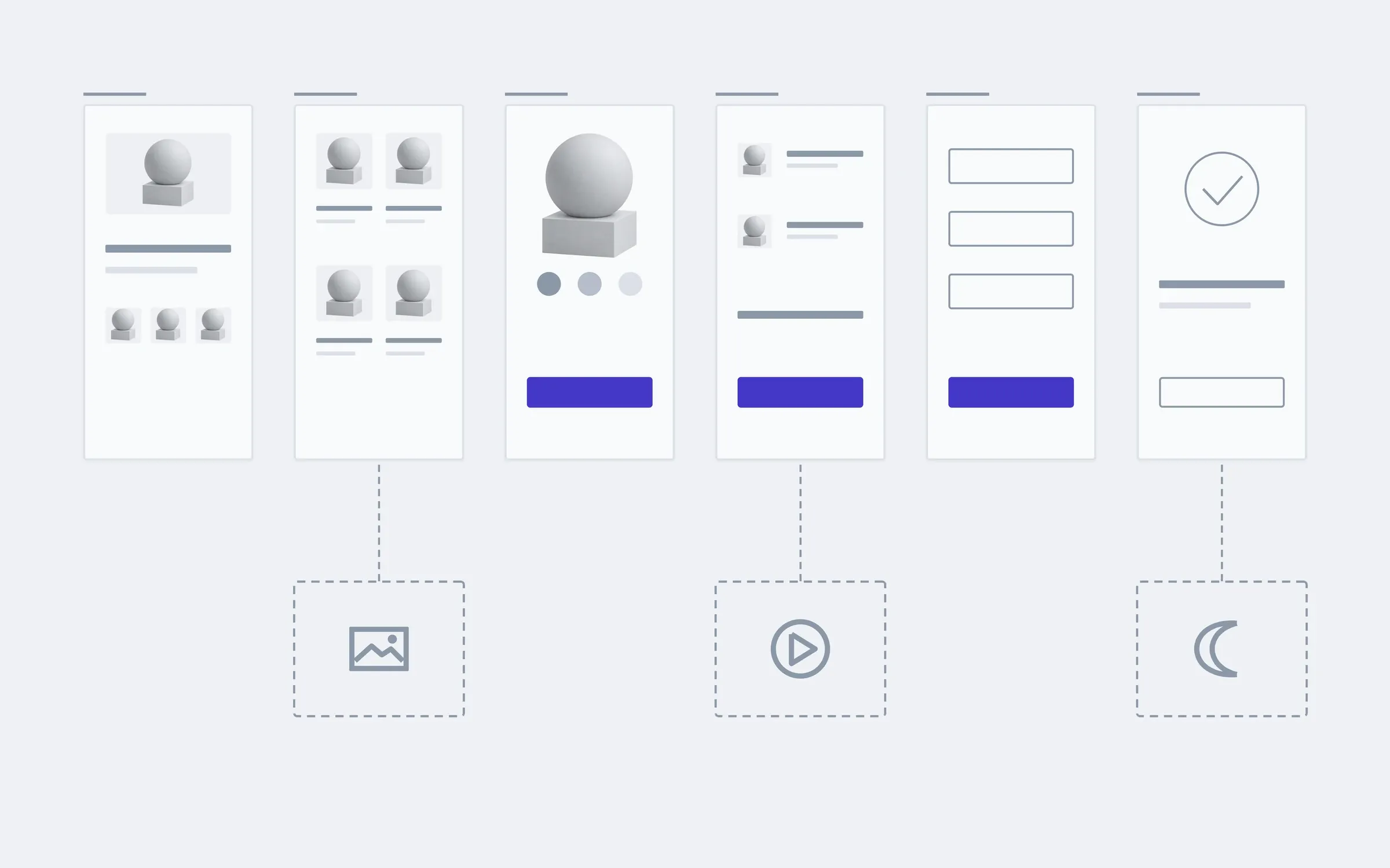
includedseparately, if needed
Visual direction
A few versions of the key screen; you choose one, and every other screen is drawn in it.
Every screen on the map
Each page or screen from the structure, not just the home page and the ones that look good in a portfolio.
Every screen's states
Empty, loading, with an error, out of stock: people always see what's happening and what to do next.
Phone and desktop
Every screen at both widths, with the block order that works on each.
A set of components
Buttons, fields, cards and icons in one place in the file, so a developer doesn't measure them on every screen.
Contrast and size
Text is readable, buttons are easy to tap, focus is visible when using a keyboard. Checked against WCAG.
Copy in place
Your copy, or honest placeholders of the right length, so the layout holds when the real text arrives.
A file for the developer
Figma with sizes, spacing and a note beside every decision that isn't obvious.
Separately
Photos and illustrations
Product shots or drawings in your style. Without them we use your photos or neutral stand-ins.
Interface motion
How blocks appear, how a button responds, how screens change. Described and shown in motion.
Dark theme
A second palette for every screen and state, checked for contrast.
How many screens a shop really has
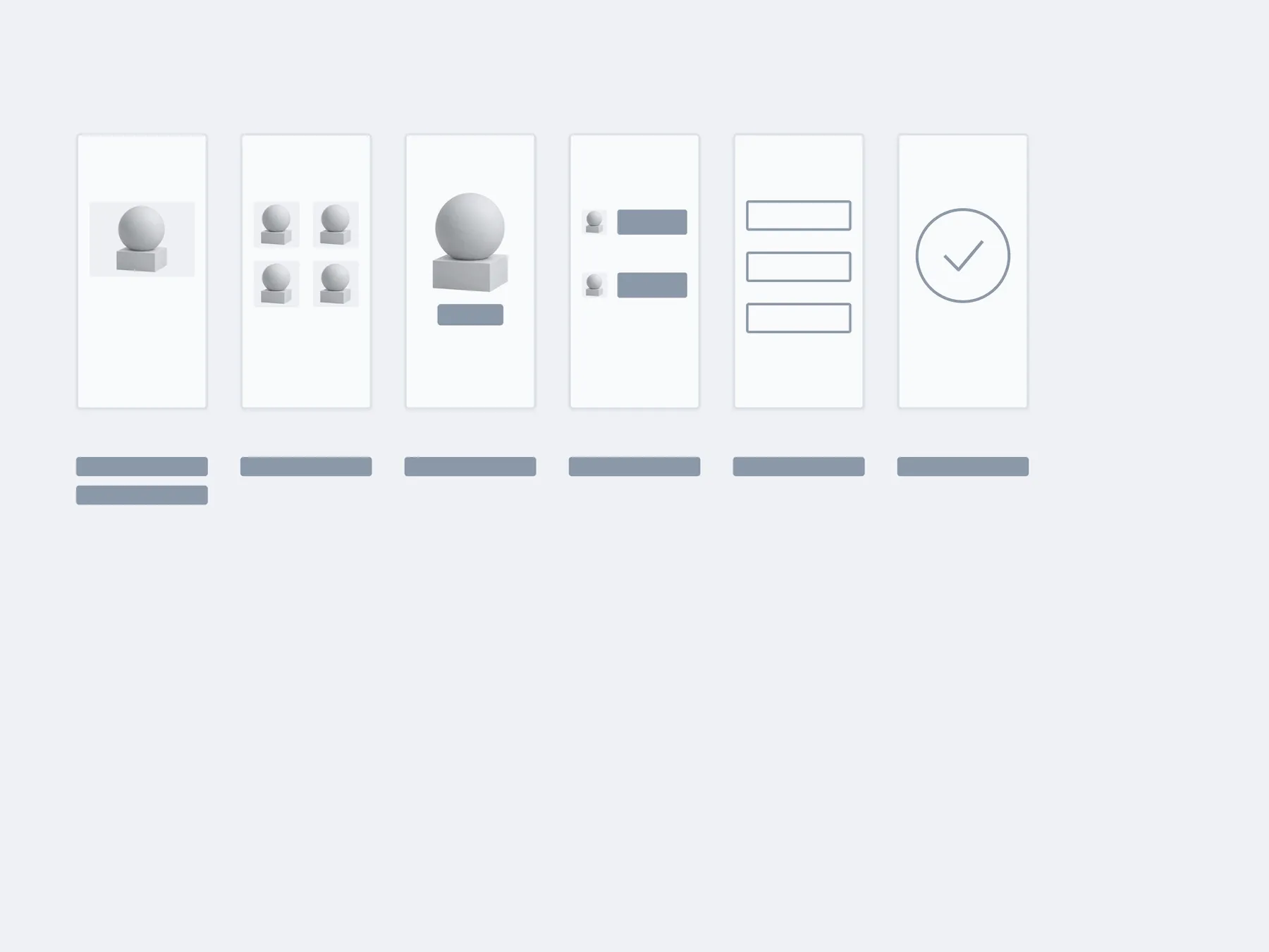
Six pages on the map look like six mockups. But each one has states a developer would otherwise have to guess, and they are what separates a design you can build from a set of pictures.
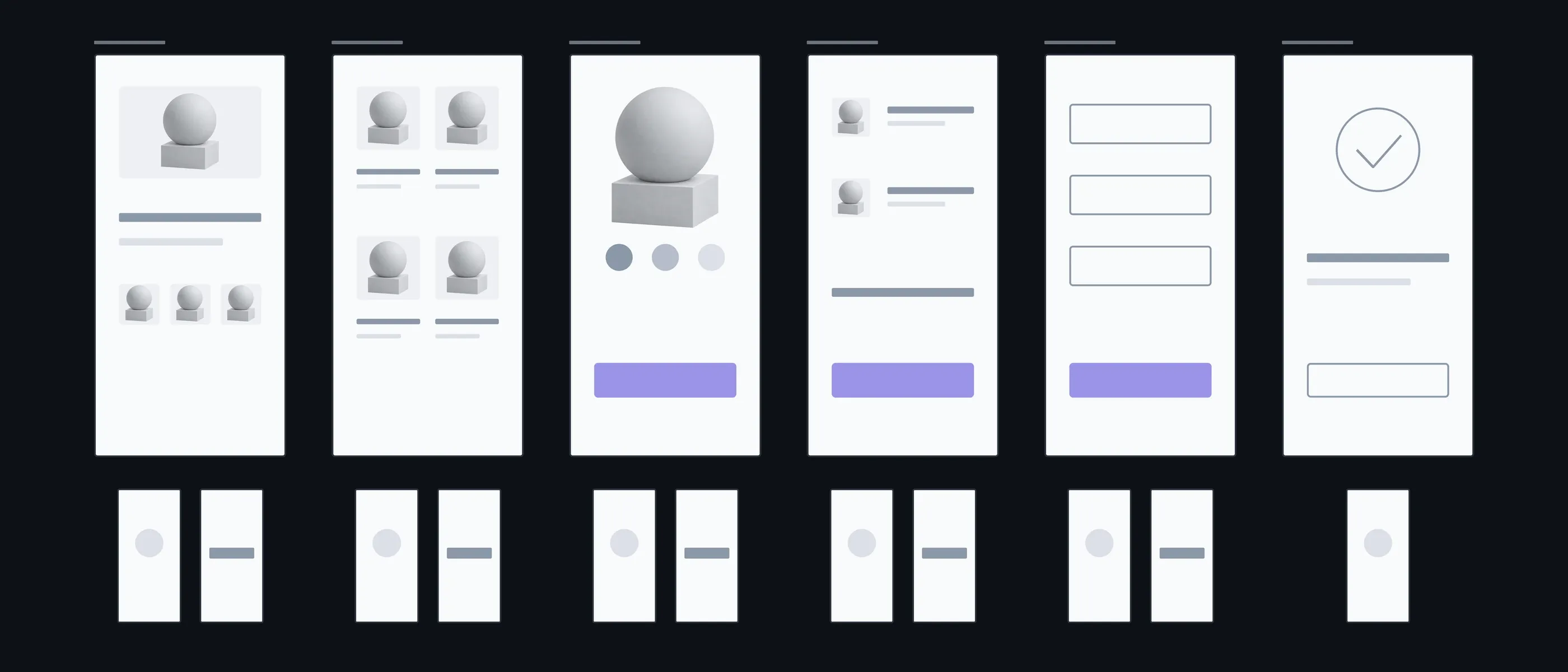
Home
Full · Loading
What people see while products are loading
Catalogue
Empty results · Filter
When a filter finds nothing
Product
Out of stock · Options
How not to lose someone when the item is gone
Cart
Empty · Full
An empty cart needs to be a screen too, not a blank page
Payment
Error · Processing
What people see while the bank decides, and when it declines
Done
Email
The page and the order email in one style
What you have in hand after each step
We agree the style on one screen, not on all of them at once. You decide how the product looks while that's still easy to change, and the rest of the screens follow without surprises.
01Conversation
We look at the structure, your brand guide or logo, and sites you like or don't.
In hand
A list of screens and what already exists for the style
02Direction
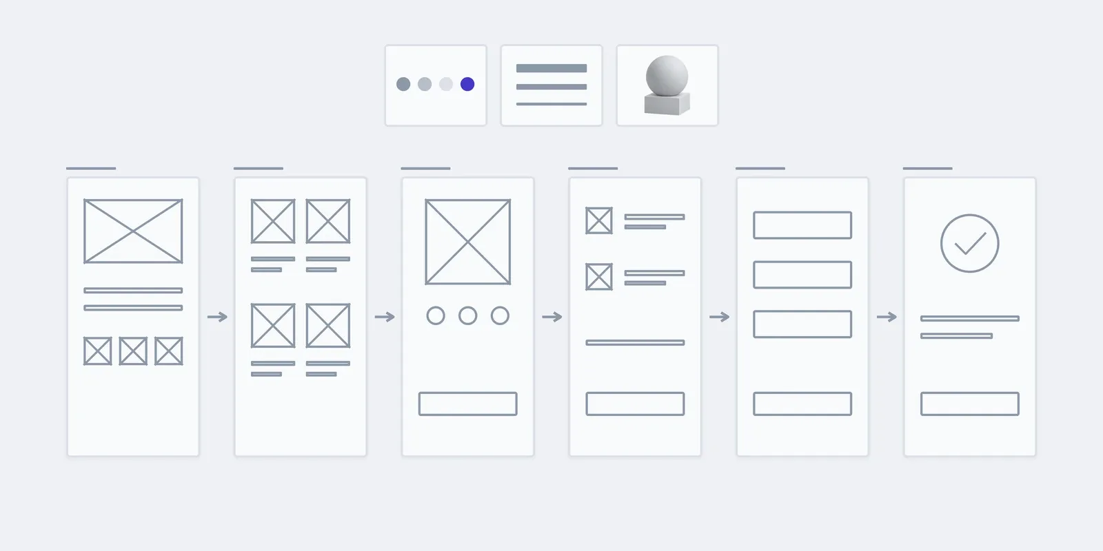
The key screen in a few style versions, built on its wireframe.
In hand
Versions to choose one from
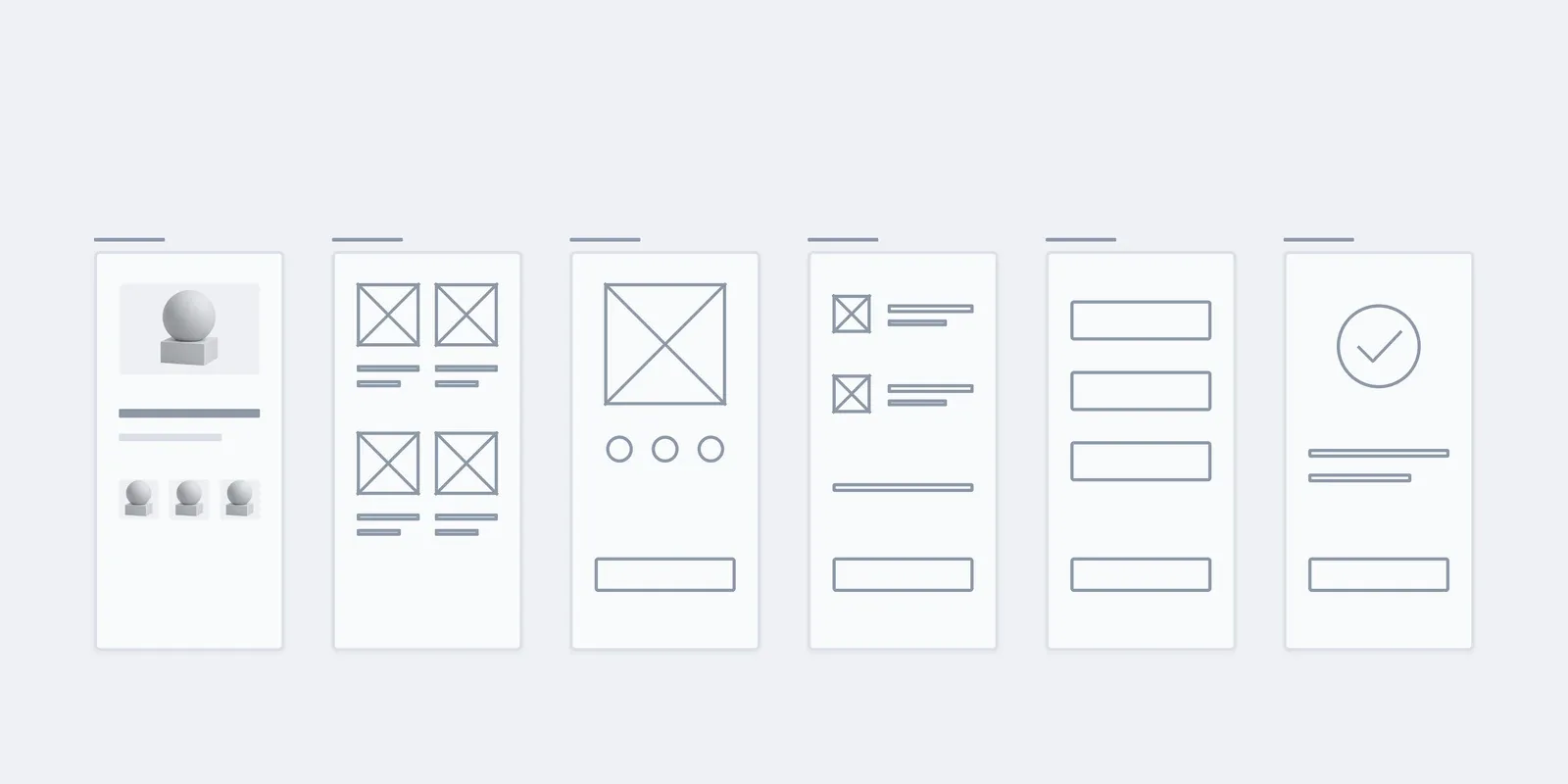
03Key screen
We finish the chosen version: type, colour, photos, buttons.
In hand
A finished key screen as the model for the rest
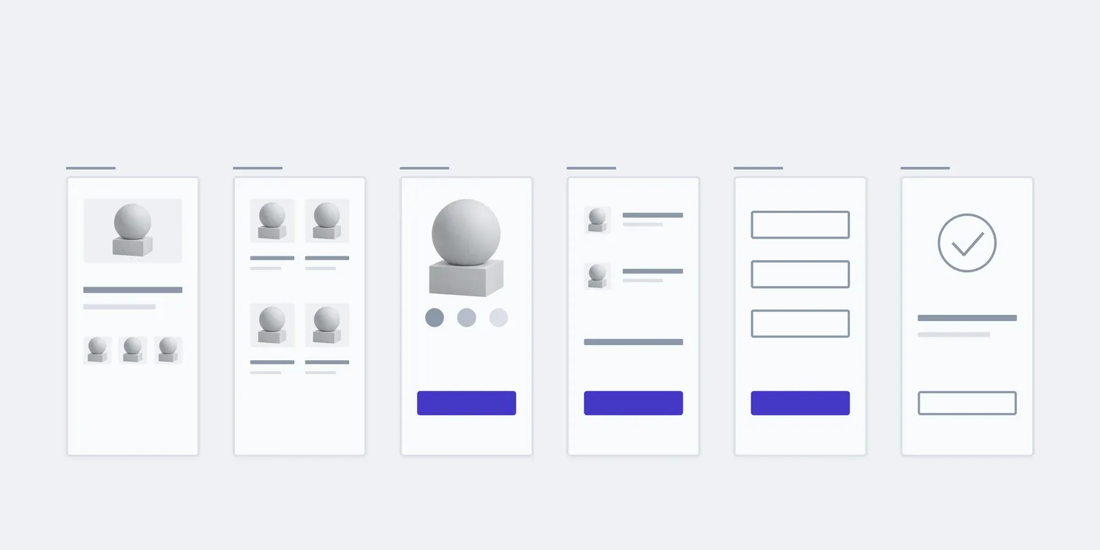
04All screens
We draw the remaining screens in the same style, for phone and desktop.
In hand
Mockups of every screen
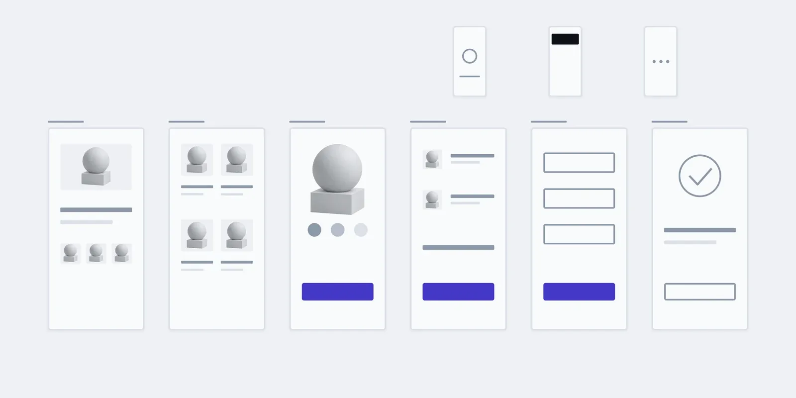
05States and handover
We add each screen's states and prepare the file for the developer.
In hand
A Figma file with states, components and notes
What the price and timeline depend on
We count types of screen, not pages: ten similar catalogue pages cost less than three completely different screens. After the conversation we give a fixed price for the whole design.
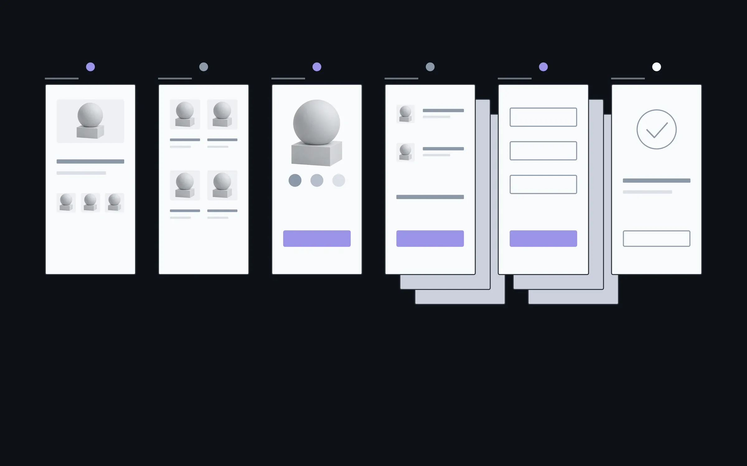
- 01Screen types
- What counts isn't the number of pages but how many of them differ. A screen built from parts already drawn costs less than a new one.
- 02States
- The more data comes and goes in a product, the more states each screen has.
- 03Widths
- Phone only, desktop only, or both. The second width doesn't cost a second design, but it isn't free either.
- 04What exists for the style
- With a brand guide the direction comes faster. If there's only a logo, we choose colours and type in the first step.
New screens are built from parts already made
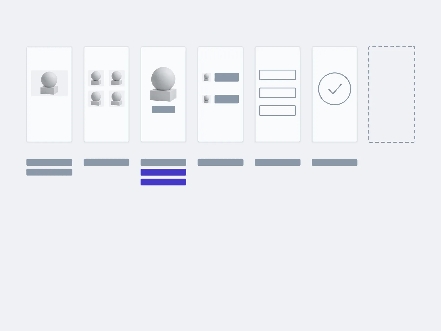
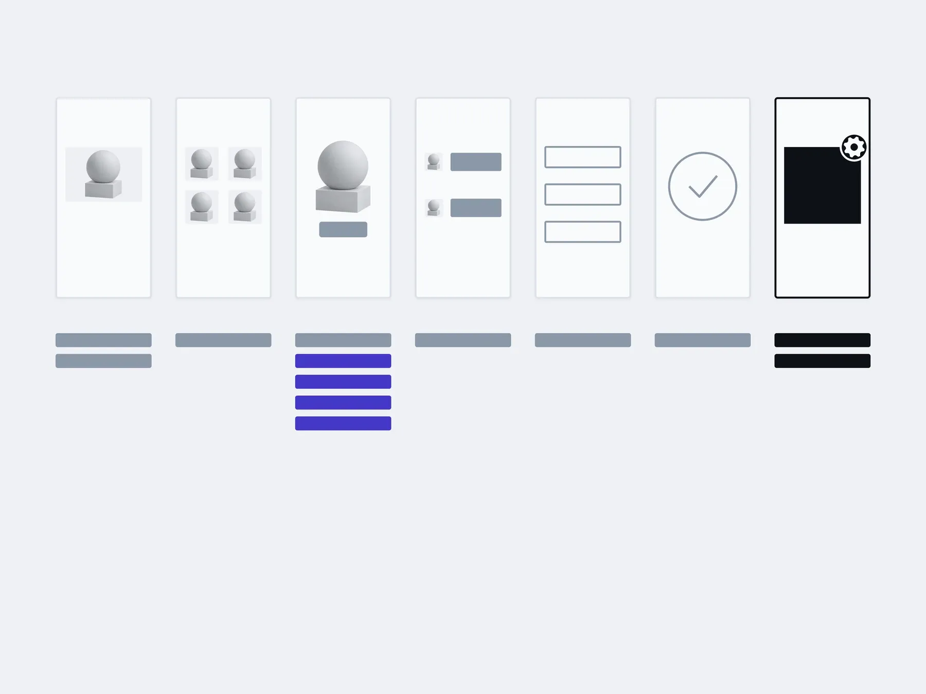
Your developers build new screens of an existing type themselves, from parts already in the file. A new type of screen, a customer account for example, we draw with you as a separate stage.
01Handover
02In 3 months
03In six months
built by your developers from existing parts: new screensadded with us: a new type of screen
The timings are illustrative: an example, not a plan.
You, in the admin
- New product pages
- Offer pages
- New categories
- Home page banners
About screen design
Can I order design only, without development?
The screens are the same in all three cases; the difference is who builds them. You can hand the file to your own developers: it holds everything they need without asking us.
Design only. You hand the mockups to your own developers. When you have a developer but nobody to draw the screens.
Design and build. We draw the screens and build them, from mockup to launch. When it's easier to have one studio answer for both the look and the code.
Tidying up what exists. The product runs, but its screens were drawn by different people at different times. When every screen looks different and each new one is invented from scratch.
How much does the design cost?
After the conversation we give a fixed price for the whole design. It depends on the number of different screen types, their states, the widths and what already exists for the style.
Do we need a structure first?
Yes, screens are drawn from a map. If there's no map, we make one as the first step. If you have one, we work from it.
How many revisions are there?
We revise each step until it's approved. Big changes after approval, a new style for example, are estimated separately.
We have a brand guide. Will you follow it?
Yes, colours, type and logo come from it. If there's no guide, only a logo, we choose the style in the first step.
Can our developer build from this design?
Yes. The file has every screen, its states, a set of components and notes on decisions that aren't obvious, and we walk through it together at handover.
How is this different from a design system?
The set of components in the file helps build these screens. A design system adds rules and variants so your team can keep building new screens for years without us.
Who owns the file?
You do. We transfer the Figma file to your account, along with the images we used and a list of the fonts.
What sits alongside screen design
Screens are drawn from a map, checked with a prototype and held together by a design system.
- Structure and journeysWhat sits where, and the path a person takes to the thing they came for.
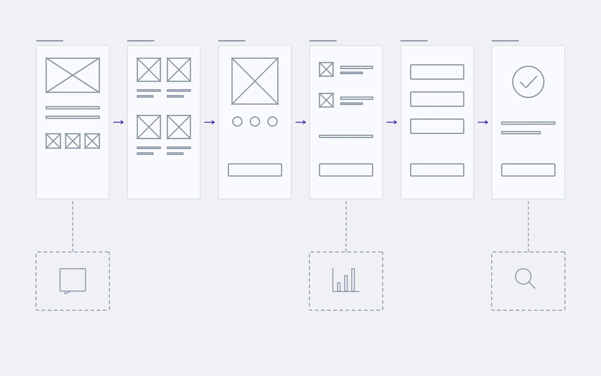
- This pageScreen designType, colour, states. Including the empty screen and the one with the error.
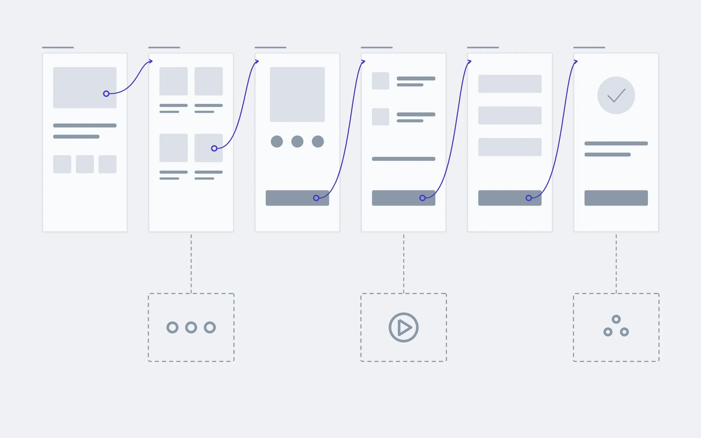
- A clickable prototypeWalk the path with a finger before any code exists.
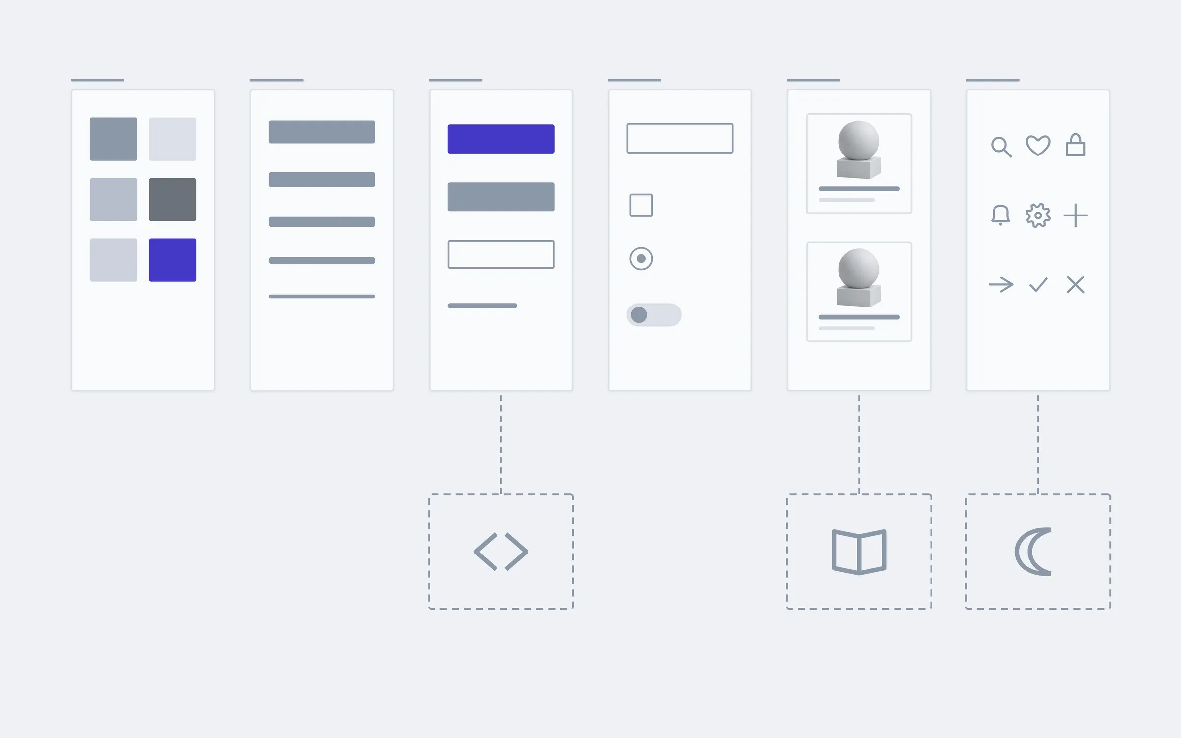
- A design systemComponents and rules, so the next screen is drawn faster than the last one.
Show us what you have: a structure, a logo, sites you like, and we'll tell you how many screen types stand behind it.
- 01A link
to the site, the mock-up or the repository, whatever exists
- 02What to change
one sentence on what should become different
- 03Who it's for
who will use it: your customers, your team, and how many